Pixel Module Reporting
This is the documentation for the pixel module reporting webapp. These pages take information about pixel modules, from the ITK production database, which is then used to create summary tables and plots. These summaries show the number of each component type, at each particular stage, at institute, country and worldwide levels. The webapp contains two main pages: one for summary tables and another for summary plots. The webapp is available at: http://uk-itk-pdb-webapp-pixels.web.cern.ch/
This webapp is built on the itk-web-apps repository, which is being developed by Kenny Wraight, I'd like to thank Kenny for his help. Kenny's itk web app uses the python package Streamlit, which provides an easy way to produce a user interface (GUI) that can interact with python code. To extract data from the ITK database, the python package itkdb is used; this is currently developed/maintained by Giordon Stark. This package is used, amongst other things, to find component type names and to output information for particular components.
Dependencies
- Itk-web-apps - project base
- Itkdb - to access the production database
- Streamlit - used for the GUI
- Pandas - to aggregate, manipulate and store component data
- Plotly - to produce interactive plots for visualisation
Pages and common options
Below is an outline of the aim of each summary page, and a guide on how to use them. Both the table and summary plots make use of the same function to retrieve the relevant component information from the ITK production database. The data each page accesses is cached between the pages, so the function won't need to rerun when the other page is selected. To cache a function in Streamlit, the input variables are checked to see if they have been used before, and if so, to load from the cache. The only input to the function that changes is the current date, this means the function only needs to run once per day. This will mean that the component information from the ITK production database is extracted by the first user each day, but the information will remain cached for the rest of the day. This should reduce loading times, but still allow for the summaries to be updated on a daily basis.
Each of the pages provides information on the current location of components, as well as the current stage of its production. If the component stage is listed as undefined, it means no current stage name could be found for that component in the database. The current component types information is provided for, are:
- Bare Modules
- Modules
- Module PCBs
- Module Carriers
- OB Wirebonding Protection Roofs
Getting started
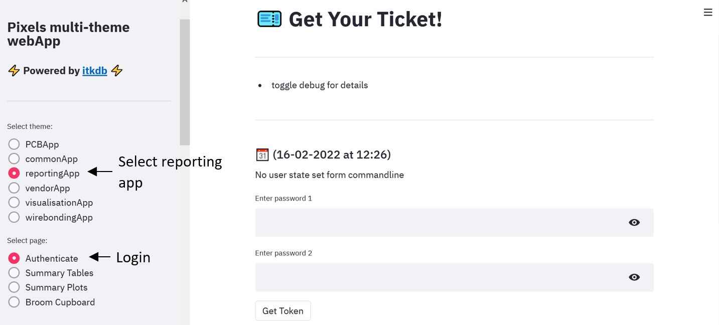
After opening the webapp, start by selecting the reportingApp theme from the menu on the left hand side. Once you have selected the app, you will be requested to login with you ITK production database login. If you do not have a login, please register for one. Once you have clicked the 'get token' button, please wait until the page has stopped running before selecting the relevant page, from the menu on the left. The image below shows the login page. The two pages currently available after logging in are: summary tables and summary plots, these pages will be discussed below.
Common component selection options
At the top of both pages is the 'Component selection options' expanding box, as shown below. To access these options, click on the box to expand it. Each of the three options can be changed using the drop down box below each option. The settings available for each of the component selections, are outlined below. If no components meet the criteria selected, a message will be displayed asking you to change your selection.
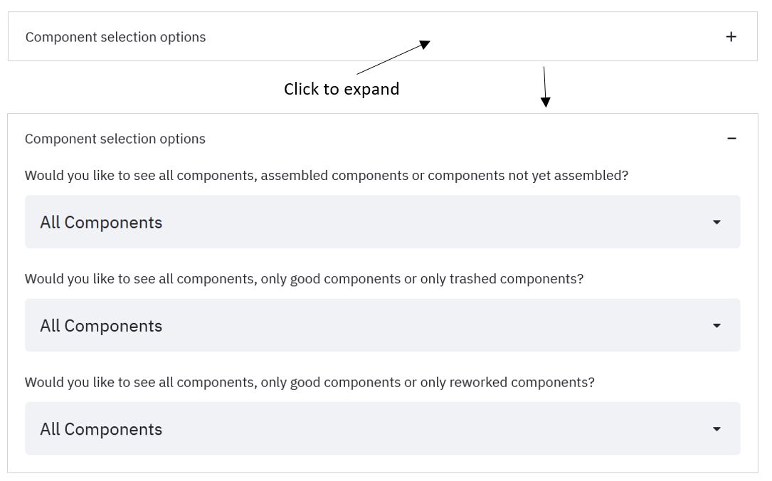
'Would you like to see all components, assembled components or components not yet assembled?' - this provides selections for the 'assembled' flag of the component. If a component has been assembled, then it has been built up into a larger component.
- All Components (default) - this makes no selection so all components are counted. This option enables the total number of components to be viewed
- Assembled Only - this selects only components that have been assembled into a larger component
- Not Assembled - this selects only components that have not yet been assembled, this is useful to look at components still being built up i.e. how many components are left
'Would you like to see all components, only good components or only trashed components?' - this provides selections for the 'trashed' flag of the component. Components that are trashed are components that are broken and cannot be fixed.
- All Components (default) - this makes no selection so all components are counted
- Good Components - this selects only components that are not trashed i.e. currently in working order. This option is useful to view only components still be worked on
- Trashed Components Only - this selects only components that have been trashed i.e. broken and unusable. This could enable stages where problems occur, to be located
'Would you like to see all components, only good components or only reworked components?' - this provides selections for the 'reworked' flag of the component. Components that are reworked are components that have failed a test but have since been fixed.
- All Components (default) - this makes no selection so all components are counted. This option enables the total number of components to be viewed
- Good Components Only - this selects only components that have not been reworked i.e. components that have passed all tests so far without problems
- Reworked Components Only - this selects only components that have been reworked i.e. components that have failed a test but have since been fixed. This could enable stages where problems occur, to be located
Summary tables
The aim of the summary tables page is to provide information on component production at three main levels: worldwide, country and at single institute level. Each table displays information about component type, split further into current stages. The tables can be expanded to full screen using a button the appears in the top right of the table when the mouse is hovered over it. A download option is provided for every table, which provides a CSV file of that table. The file name has the date of database access attached, along with any country or institute selection.
ITK pixel overview main table
The first table available to view is the ITK pixel overview main table, this gives a worldwide view of component production. Along the side of the table is a list of component types, this is then further divided into component stages. Across the top of the table is a list of countries that produce these component types, each country is then divided into the institutes within that country. For countries with more than one institute, a country subtotal is provided. As mentioned above, the table can also be made full screen.
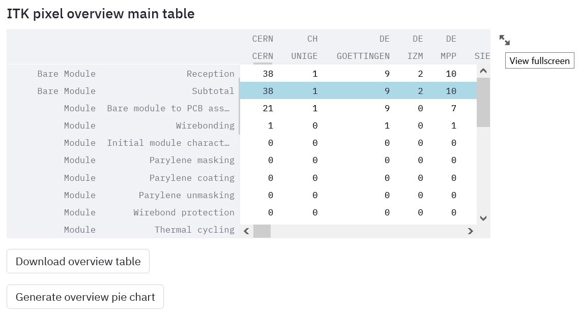
The options below the table allow for it to be downloaded, or to be used to generate an interactive pie chart.
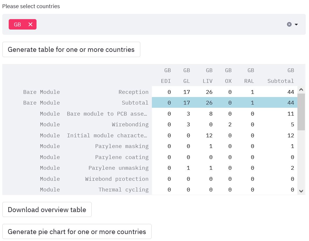
Multiple country overview
The next table that can be viewed is the multiple country overview, which shows component production at country level. This table shows information, for all institutes within the selected countries. Once you've selected your countries of interest, click the 'generate table for one or more countries' button to view the table. As with the other tables, the table can be downloaded or used to generate an interactive pie chart.
Single institute overview
The final table available is a single institute view. Use the dropdown box to select an institute of interest, by default this will be set to your home institute if it contains the correct components. Once you have selected an institute please click the 'generate table' button to produce the table.
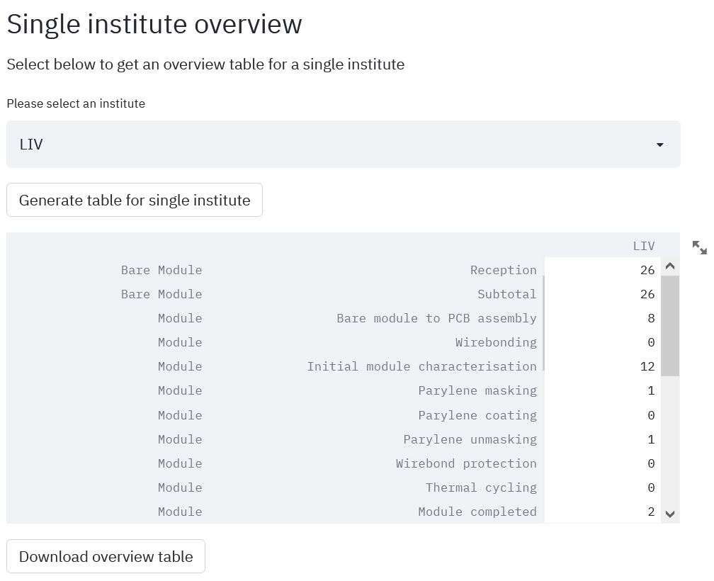
As with the other tables, an option to download the table is also available. If the institute selected does not produce any of the supported component types, a message will be displayed asking you to change your selection.
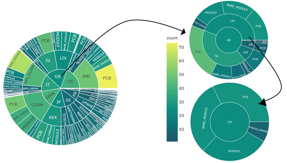
Interactive pie charts
As mentioned above, some of the tables can also be used to produce an interactive pie chart. Each segment of the pie chart can be clicked on to be expanded. An example of using the pie chart is shown below.
Summary plots
The aim of the summary plots page, is to provide bar chart plots of component production. These plots give information for: all component types in all countries; a particular component type in all countries; all component types in a particular country; and a particular component type in a particular country. A download plot data option is provided for every plot type, this provides a CSV file of data used to generate the plots. The file name has the date of database access attached, along with the plot type, country and component selections. The plot types available are discussed below.
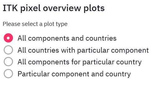
All components and countries
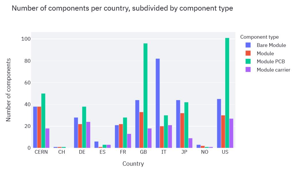
These plots give a worldwide view of component production, and take no input.
- Number of components in each country subdivided by component type
- Number of component type subdivided by country
All countries with particular component
These plots take an input of a particular component type, and give a worldwide view of how components are progressing. Some plots do not display useful information with components with only a single stage.
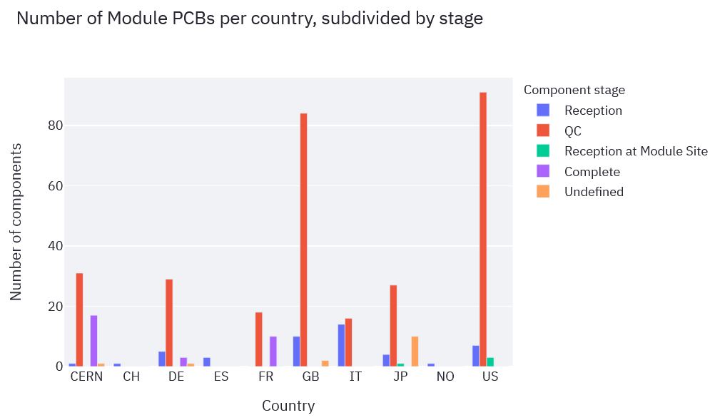
- Number of component type per country split by stage
- Number of components type per stage split by country
- Number of components type in each stage
All components for particular country
These plots take an input of one or more countries to give a view of component production for the institutes within those countries. If too many countries are selected, the plots can become overloaded with information, and cease being useful.
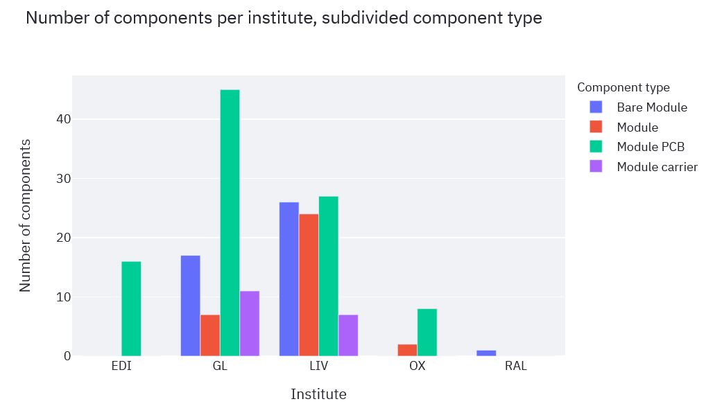
- Number of components per institute split by component type
- Number of components types split by institute
Particular component and country
These plots take an input of a particular component type, and a list of one or more countries. These plots aim to show how components are progressing through the stages of production. Some plots do not display useful information with components with only a single stage. If too many countries are selected, the plots can become overloaded with information, and cease being useful.
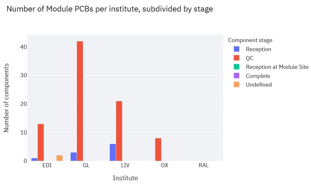
- Number of component type per institute split by stage
- Number of component type per stage split by institute
Plot canvas settings
Each of the plots has several options that appear when the mouse is moved over them, the most useful being the download and full screen options. Unfortunately Plotly automatically sets the file name to newplot.png which is not particularly useful. When the mouse is placed over a bar, information about it (such as the number of components and county) is displayed. It is possible using another setting, to display information for all bars in a group. Below is an outline of the options Plotly provides.
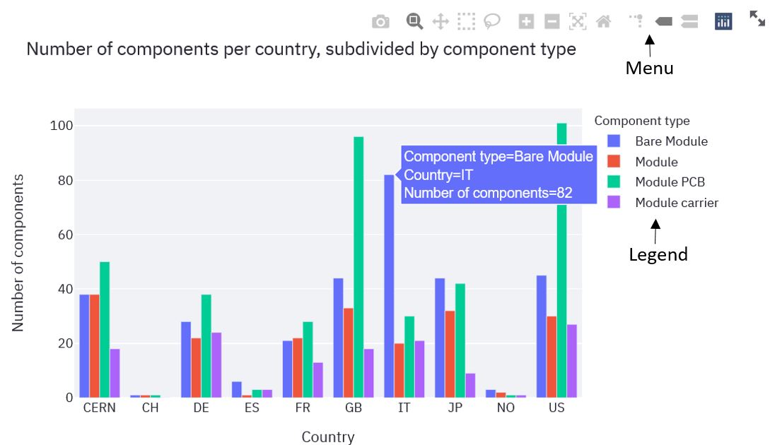
By clicking on an item in the legend, that item can be toggled on or off. If the item is turned off, the plot will be reproduced, with that element removed. This can allow only certain components of interest to be selected.
Plotly menu options
Plotly provides several menu options, some of which are more useful than others. From left to right in the image above, the options are:
- Download plot as PNG- save the plot
- Zoom- to zoom in, click and drag box round the area of interest. This is the most useful zoom method
- Pan- move around the axis
- Box Select- click and drag to highlight particular bars, no other purpose
- Lasso Select- click and drag to highlight particular bars, no other purpose
- Zoom in- as described, for better results use the first zoom method
- Zoom out- as described, for better results use the first zoom method
- Autoscale- reset back to original view
- Reset axes- reset back to original view
- Toggle Spike Lines- toggle line that show the current bars location on the y axis
- Show closest data on hover- display data on current bar when the mouse is placed over it
- Compare data on hover- display data on all bars in that x axis position
- Produced with Plotly- link to plotly documentation
- View fullscreen- as described
Known Bugs
There are two bugs that appear on very rare occasions, usually when a significant number of people are accessing the database. If these errors occur, reloading the page and rerunning should fix the problem. If these bugs occur repeatedly please let me know. The two errors are:
- 500 HTTP response- Uuobject which is to be updated not found
- 504 HTTP response- the server didn't respond in a timely fashion
For bugs, feedback or suggestions for the reporting webapp, please contact: Conor McPartland at: conor.mcpartland@cern.ch